
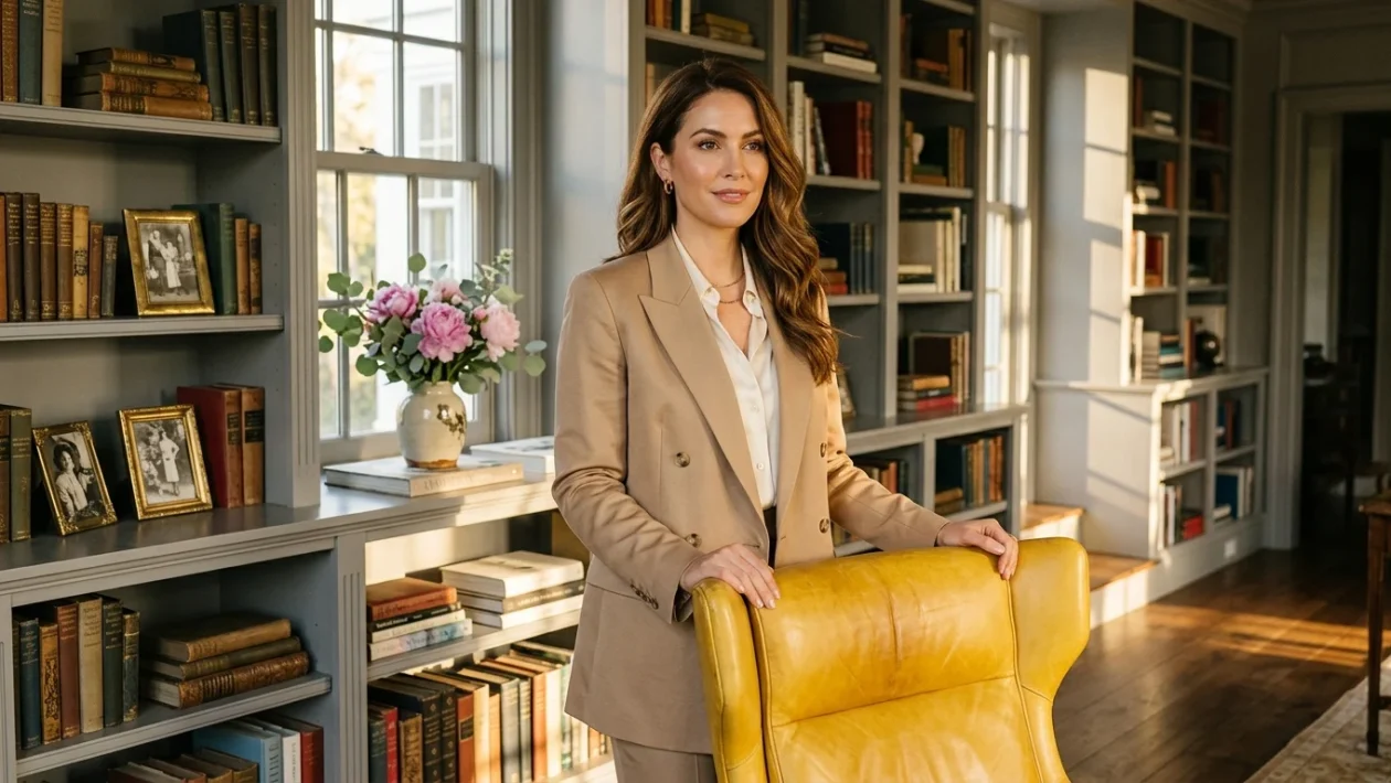
Half a century ago, Benjamin Moore released a palette of 191 paint colors designed to capture the architectural essence of the 18th and 19th centuries. The year was 1976, and the American Bicentennial had sparked a massive revival of heritage design.
Today, that same Historical Color Collection continues to dictate interior trends. While the full catalog spans nearly 200 archival shades, six specific colors remain undisputed best-sellers generation after generation.
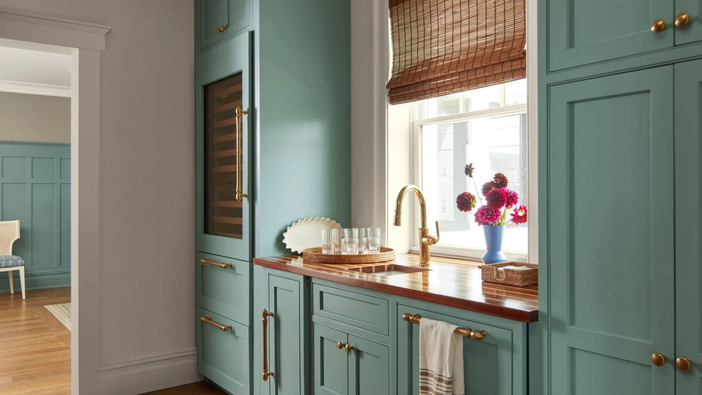
Kitchen with cabinetry painted in Benjamin Moore’s Stratton Blue, a wooden countertop with a gold faucet, a rattan blind on top of the window, and a vase of pink flowers on the windowsill.
The Heritage Formula
The durability of these colors lies in their muted, sophisticated character. They balance historical authenticity with modern versatility, transitioning seamlessly between traditional homes and contemporary spaces.
“These colors were carefully curated to capture the richness, authenticity and character of historical design while remaining relevant for how people live today,” says Hannah Yeo, Senior Manager of Color Marketing at Benjamin Moore.
Helen Shaw, the brand’s International Director of Marketing, notes that the shades offer presence without dominating a room. They possess a precise level of saturation that prevents them from feeling tied to a passing fad.
The Indispensable Neutrals
Benjamin Moore recently revealed the top performers from the collection, led by a highly recognizable neutral.
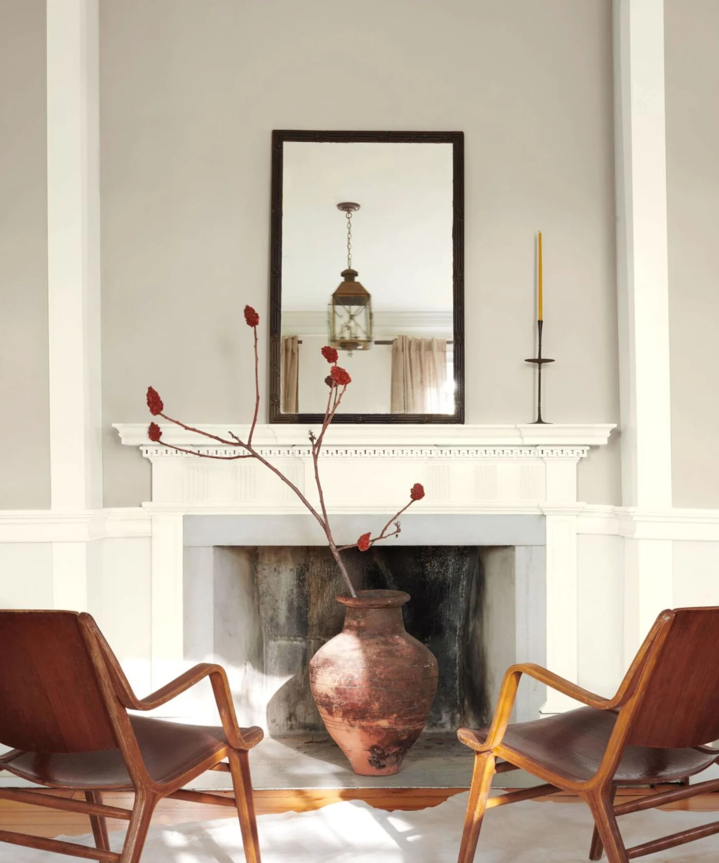
Living room with large white fireplace with a rustic pot holding foliage, walls painted in Benjamin Moore’s Revere Pewter, a large mirror on the mantelpiece, and two midcentury leather lounge chairs.
Revere Pewter remains a cornerstone of residential design. Unlike cool grays that can leave a room feeling stark, this hue brings a quiet warmth that bridges warm and cool palettes effortlessly.
For a lighter touch, Edgecomb Gray offers a softer alternative. Its subtle pink undertones refresh spaces while maintaining a welcoming foundation. Both colors act as architectural anchors, connecting diverse design elements with ease.
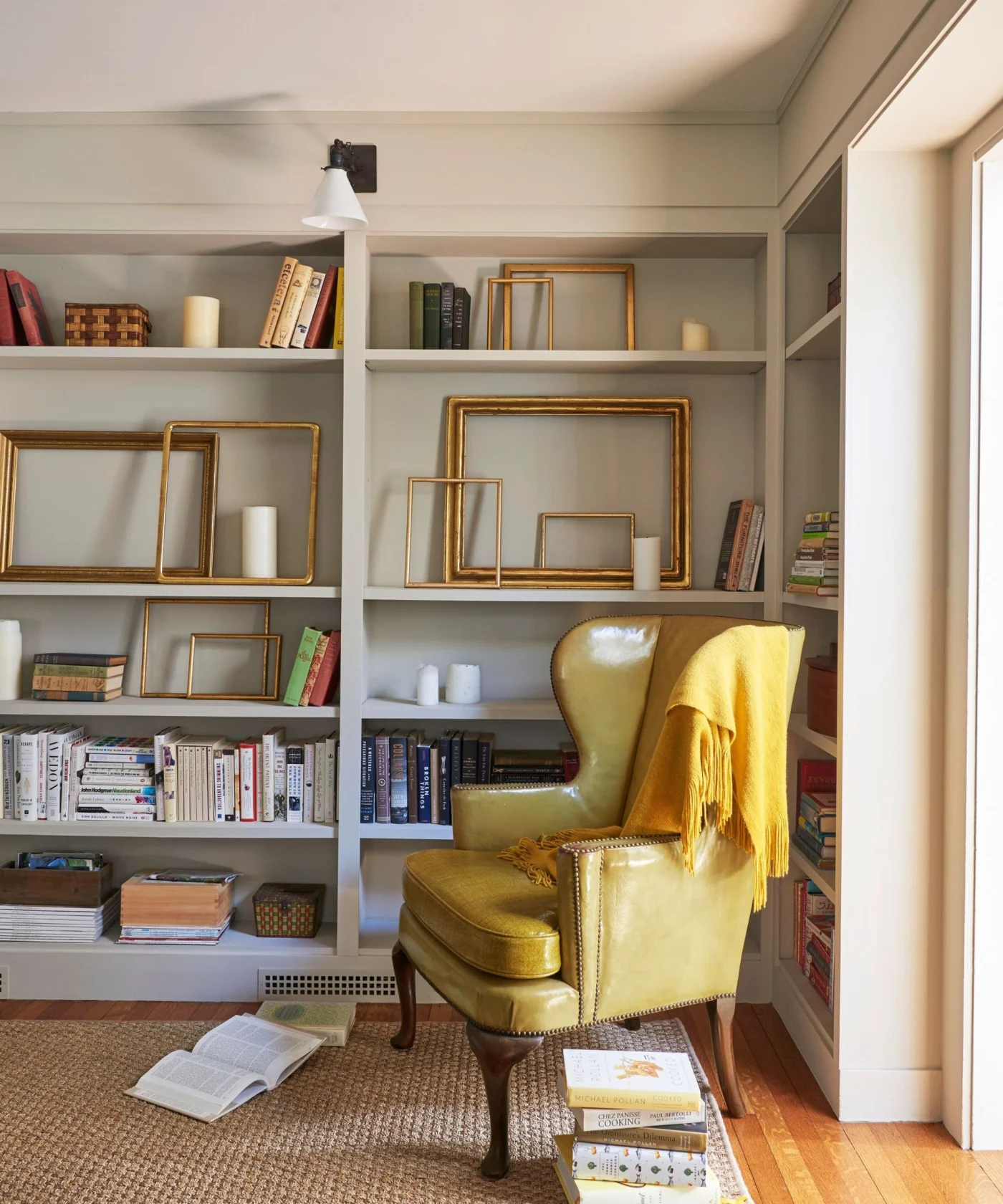
Home library with built-in bookshelves painted in Benjamin Moore’s Edgecomb Gray, books and gold picture frames on the shelves, a yellow leather armchair, and a yellow blanket draped over it.
Nature-Driven Greens
As homeowners increasingly look to ground their spaces with organic energy, two green shades continue to dominate the charts.
Benjamin Moore best selling paints
Saybrook Sage delivers a highly adaptable blend of green and gray. For those seeking depth, Essex Green provides a rich, moody hunter-green option.
Shaw recommends using these greens across all four walls of a living room. Pairing them with darker gray woodwork creates a cohesive, tonal environment.
The Quintessential Navy
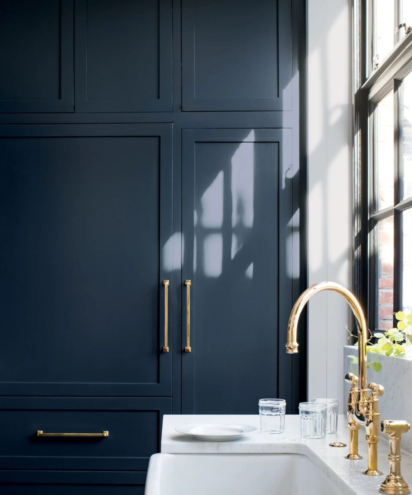
Hale Navy has topped best-seller lists since its introduction. It functions as a softer, yet deeply classic alternative to stark black or heavy brown.
Shaw highlights its effectiveness in high-traffic spaces like living rooms and kitchens. Paired with a crisp white, Hale Navy creates a striking contrast on shaker cabinetry or industrial-style fixtures.
The Neoclassical Red
While neutrals and navies are expected staples, the resurgence of burgundy places a bolder heritage color on the top-sellers list.
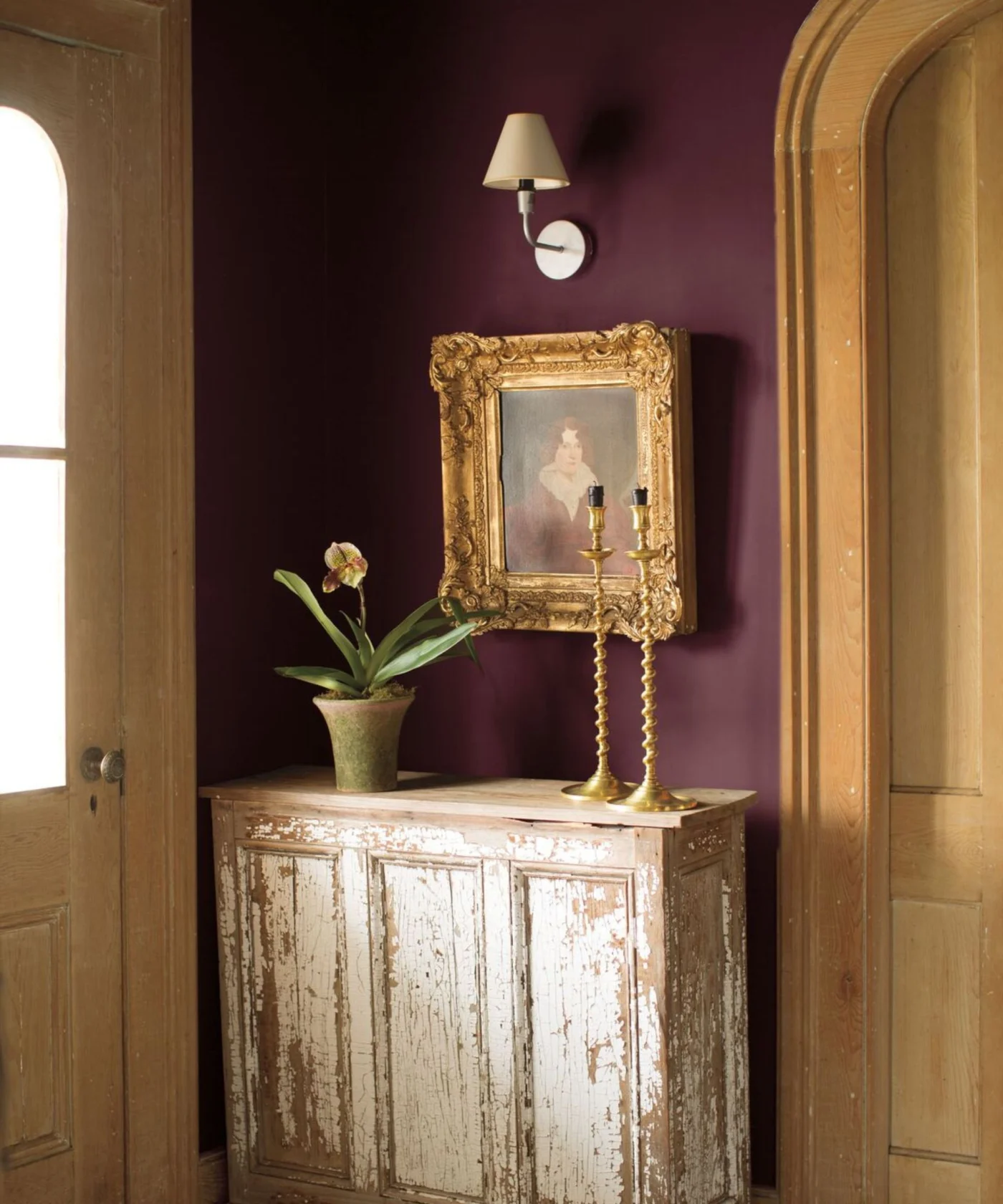
Entryway painted in Benjamin Moore’s New London Burgundy, a distressed console table with gold candlesticks, a potted plant, and an antique painting, and a sconce above, and arched wooden doors.
New London Burgundy is a rich red anchored by brown undertones. Evocative of 18th-century neoclassical interiors, the color adds sophistication without overwhelming a space.
“Unlike brighter reds, burgundy feels grounded and elegant,” Yeo explains.
Shaw suggests pairing New London Burgundy with earthy tones like beige or taupe. Applying the color in a matte finish softens its bold nature, giving the paint a chalky, highly livable appearance.